So? I use Kenney assets too do you have problems with that? This was my first game so I didn't know how to make digital art, now I'm learning pixel art
I didn't have time to get through much, but one thing that stands out as a potential improvement is having a death animation. The hard cut to the game over screen is pretty jarring. Other than that, I enjoy the sleek and modern look of the game as a whole. I thought the controls felt good, and it seemed like a solid platformer overall.
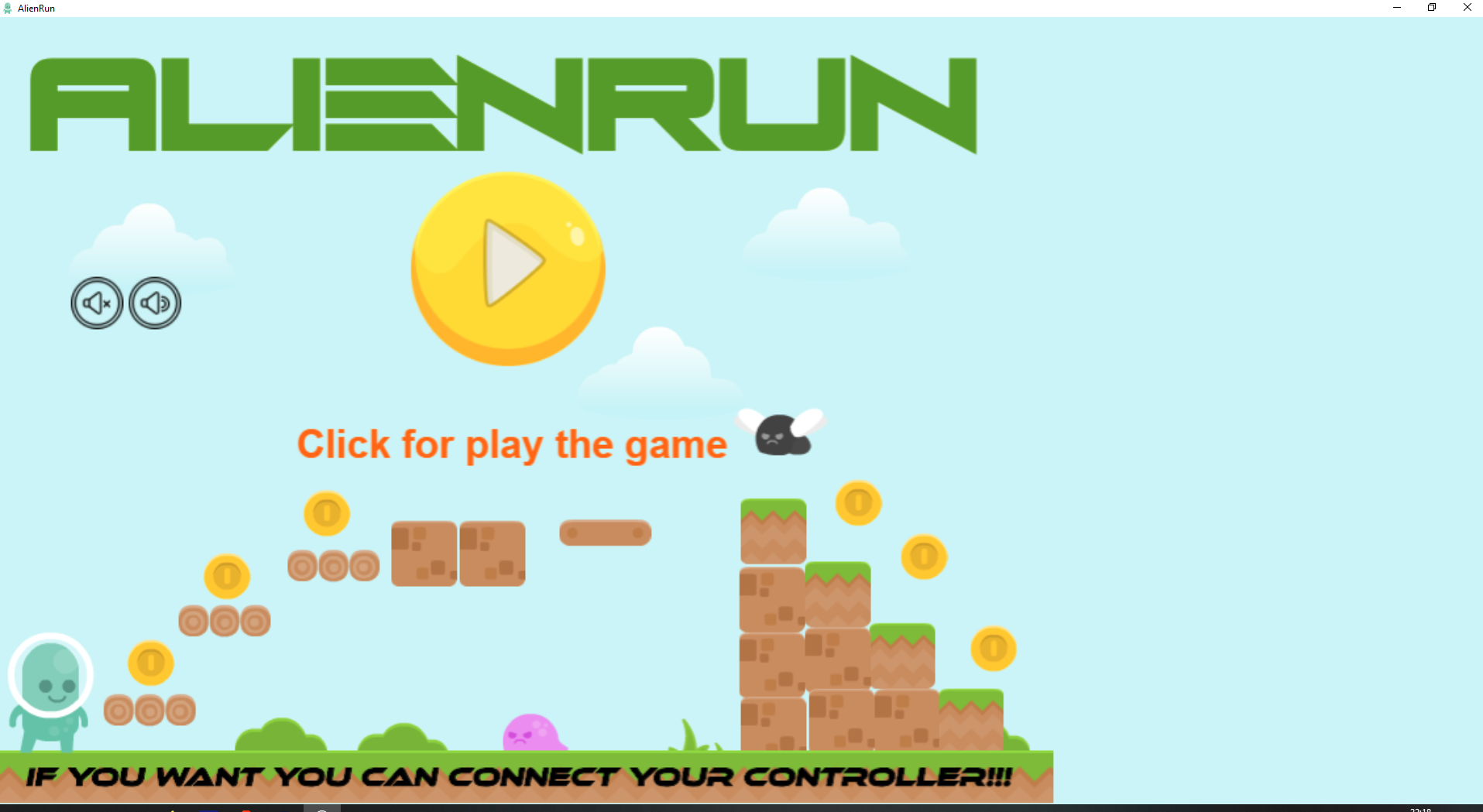
For a beginner developer this is impressive. The only problems I have is that the Menu UI is not centered in my screen and that the enemy collisions is a bit wide. But other than that this was fun to play and I would love to see more!
As a beginner gamedev myself, this is a pretty good game! And I got some feed back for it
I think that you should make enemy collisions a bit smaller, since sometimes it feels unfair. Remember, you wanna make the players feel good when playing your game.
Try to make some health system so the player can take more than one hit.
Also, the Menu UI is not centered in my device, this is a bit annoying, but I have seen bigger games with similar problems, so its not a big deal
The music can become a bit annoying too, since the melody is too short and has no variation.
The gameplay and controls feels good. A bit slow IMO, but it does not feel bad at all.
← Return to game
Comments
Log in with itch.io to leave a comment.
So? I use Kenney assets too do you have problems with that? This was my first game so I didn't know how to make digital art, now I'm learning pixel art
BRUH
I worked 7 months on that game
This is our let's play of your games:
Thank you!!!
My let's play :D
Thanks!
Hello, the game isn't claimable atm
Try now, sorry for the problem
I didn't have time to get through much, but one thing that stands out as a potential improvement is having a death animation. The hard cut to the game over screen is pretty jarring. Other than that, I enjoy the sleek and modern look of the game as a whole. I thought the controls felt good, and it seemed like a solid platformer overall.
Thank you!!!
Any way to make the game full screen on windows?
Yes, click on the full screen button
for some reason the game is in window mode
This is good, don't worry and have fun!!!
For a beginner developer this is impressive. The only problems I have is that the Menu UI is not centered in my screen and that the enemy collisions is a bit wide. But other than that this was fun to play and I would love to see more!
Thank you!!! Can you rate the game?
As a beginner gamedev myself, this is a pretty good game! And I got some feed back for it
I think that you should make enemy collisions a bit smaller, since sometimes it feels unfair. Remember, you wanna make the players feel good when playing your game.
Try to make some health system so the player can take more than one hit.
Also, the Menu UI is not centered in my device, this is a bit annoying, but I have seen bigger games with similar problems, so its not a big deal
The music can become a bit annoying too, since the melody is too short and has no variation.
The gameplay and controls feels good. A bit slow IMO, but it does not feel bad at all.